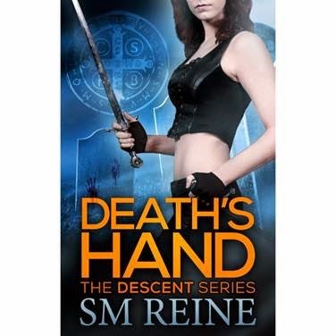
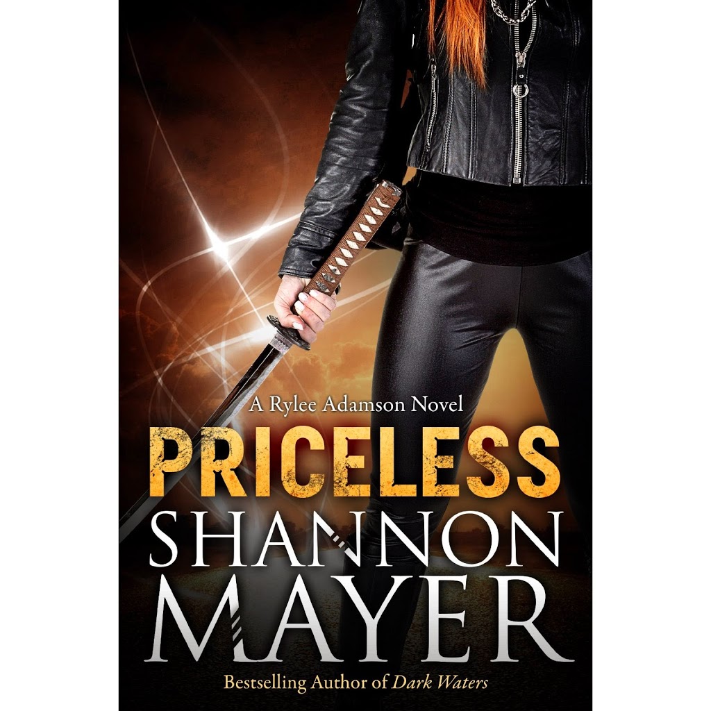
How do you feel about headless bodies on book covers? Not as in decapitated and spouting blood, but the kind of cover where part of the model’s head is cut off by the top of the book.
Like this:
Or this:
Love ’em? Hate ’em? Never even thought about ’em?
There are some people (and Drama Duck is one of them) who will pass over a book if the cover shows the model’s face. They don’t like the image interfering with their own imagining of what the character looks like. I don’t know how many of these people there are, but there are enough to have spawned a trend in cover design for obscuring the model’s features. Sometimes that’s done with shadows or positioning the head at an angle, but quite often the top of the face is just chopped off.
I like both those covers I showed you, but I must admit I’m more of an “eyes are the windows to the soul” kind of person – I like to see a face. Not that it influences my buying habits at all. I’m usually drawn to colours first anyway, and if I stop for a closer look it will be the blurb and a sample of the writing that decides whether I buy or not.
But now I’m working with a designer on the cover for Twiceborn. The great thing about self-publishing rather than going with a traditional publisher is you get complete control over what your cover looks like. Trad-pubbed authors get little or no say in their cover design, and are sometimes stuck with covers they hate.
But having to make all the decisions can also be the bad thing about self-publishing! Headless or full-faced? Which do you prefer in covers? Or isn’t it important to you? (I could well be over-thinking the issue, I realise. Maybe most people really don’t care and I should just take a deep breath and move on.)
What do you think, Internets?


I once wrote a post about this–I’m fine with the partial-body designs, but they really bother some people.
Of course, you don’t have to use a person … you could use an object, scene, or symbol.
Symbol covers are very popular in some genres, aren’t they! I haven’t seen too many in Urban Fantasy though. So many decisions!
I like a scene. It helps me to place the story in my mind. x
You will be happy to hear then that the Sydney Harbour Bridge makes an appearance on the cover!