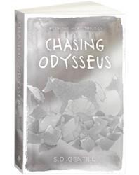
You can’t judge a book by its cover, right? Well, yes … and no.
Sure, some great books have lousy covers, and some pretty ordinary books have very attractive covers, so the quality of the cover doesn’t necessarily match what’s inside. In that sense, judging a book by its cover can lead you astray.
But in another sense, of course you can judge a book by its cover. That’s what they’re for.
Publishers spend a lot of time and money on covers. They’re a selling tool, meant to entice you into picking up the book and purchasing it. And potential buyers like to know what they’re getting.
Ever looked at the spines of the books in the science fiction and fantasy section? You can tell which ones are the science fiction books at a glance, because they nearly all have black spines, whereas the fantasy ones are more likely to have coloured artwork extending into the spine.
In the same way, if a book’s title is in flowing script above artwork of a hot bare-chested man, hot woman in a flowing dress, or a hot bare-chested man embracing a hot woman in a flowing dress, it’s a romance. Readers know what “their” kind of book looks like, and they search for more of the same.
There are trends within genres too, of course. Not so long ago, most fantasy covers featured a dragon – even if there was no dragon in the story. Twilight spawned a whole host of copycat covers after the success of its black-cover-with-single-dramatic-image style.
Different countries have different preferences in covers. What will sell a book in the UK won’t entice US buyers at all. Australian customers don’t go for European covers and vice versa.
Which means that one book may have many different covers. Different covers for release in different countries. Different covers between the hardback and paperback versions. Different again for later reprints or when rebadging a series.
What makes a cover enticing to potential readers? If publishers could pin that down every book would be a bestseller. They may know the genre conventions, they can look at past successes and try to reproduce that “winning formula”, but in the end it’s a lottery. Just because lots of YA covers have photos of girls from the neck down doesn’t mean that whacking a headless girl on yours will sell the book.
In the end, what attracts a reader to a particular cover is subjective. People’s reactions to covers are as varied as their reactions to the stories inside. Consider Exhibit A, the cover of Liar by Justine Larbalestier:
Leaving aside the whole controversial “whitewashing” aspect (a storm of protest over the white girl on the original cover — the protagonist is supposed to be black — forced the publisher to come up with this cover instead), I wouldn’t cross the room to pick up this book. And that’s the effect a cover needs to have. Note, I’m not suggesting this is a bad cover, just demonstrating how subjective perceptions are.
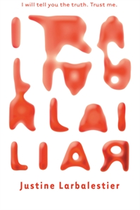
This version of Liar’s cover, however, I find intriguing. I love the way the letters change, graphically illustrating the point of the book, that words can’t be trusted. This is such a clever cover when you’ve read the book, as it’s not just about lies but physical changes from one thing to another, and these letters are morphing from one form into something else. What that something might be isn’t clear, yet their red colour suggests blood, which leads you to assume it’s something sinister or dangerous. I’d definitely walk across the bookshop to check this out.
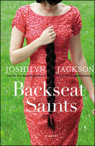
Then there’s Backseat Saints.
This cover hits the themes of the novel, but for me the visual appeal is so-so.
This one thrills me so much I actually squeaked with excitement when I found it in the bookshop. Same great book inside each one, but wow! this cover blows me away. The glorious saturated contrast of that vibrant red and green is the first thing that hits me, and then there’s the image. OMG just look at that hair!! WHY DID SHE CUT IT OFF??? I couldn’t wait to read the book to find out. Talk about a cover that did its job.
And sometimes an author gets lucky. I’ve seen two versions of Jennifer Hubbard’s The Secret Year, and both of them have that “pick me! pick me!” quality to them.
This one’s very striking with all that black and the partial faces. Combined with the title, you just know these two are hiding things, and you want to read the book to find out.
Then there’s this one. I am so drawn in by that girl’s melancholy gaze it takes me a while to notice she’s in bed with a naked guy. She looks so troubled I wonder if it’s because she’s hiding secrets from him or vice versa. Once again I feel compelled to read the book and find out.
So what’s an author to do? How can you make sure your cover’s going to attract the greatest number of readers possible? It’s a good question but I don’t think there are any good answers. Readers’ taste in covers are just as subjective as their taste in stories. In any case most authors won’t get much of a say in the design of their cover.
The ironic part is I would have read these three books even if they came covered in brown paper. I was choosing on the author’s name and familiarity with their writing through their blogs. And the reality is that the one factor that most helps to sell a book is name recognition.
So maybe a good cover helps, maybe it doesn’t. All an author can really do is write the best book they can … and then cross their fingers.


